Today we worked on further fine tuning our work and getting last minute critiques, then working on finishing off blogs, workbooks and final printed brochures.
The critique i got today was:
Cover:
-Make cover title same size as page titles
-move 'creative' and 'wellington' closer
-move sub heading further away and make black
Map/introduction:
-Make title red
-extend yellow road on map
-pinpoint airport
-label spots of interest on map
Checklist:
-change title and add subheading for it to coincide with the other tiles and subheadings
General:
-Make all page titles sit at same place on the grid
- Kerning titles
-Move subheading less crammed to titles of pages
This is my brochure after fixing up final points:


I also wrote out my rationale:
The topic I chose was seeing/experiencing art sculptures
throughout Wellington City. I wanted to convey excitement and interest in the
sculptures to show just how much vibrancy Wellingtons art brings to the city. In
order to create a feeling of excitement I combined each sculpture with
different elements (water, fire, wind) to create the idea of movement in an
otherwise static image. I made sure my compositions centered around the
sculptures themselves, highlighting that the act of seeing them is important
and that they should dominate your attention, due to this my imagery takes up a
large majority of space in the grid and overlaps pages in order to create this.
Also my use of circle imagery/shapes was in order to reinforce this idea of
excitement, as excitement is fluid and moving thus with a shape such as a
circle is not rigid and thus does not feel static hence communicating this idea
of fluidity. What I learnt about my own process is that I rely heavily on
critique while being open to critique is good I need to learn to be able to scrutinize
my work further and effectively when working individually so I do not have to
wait for critiques in order to proceed further.
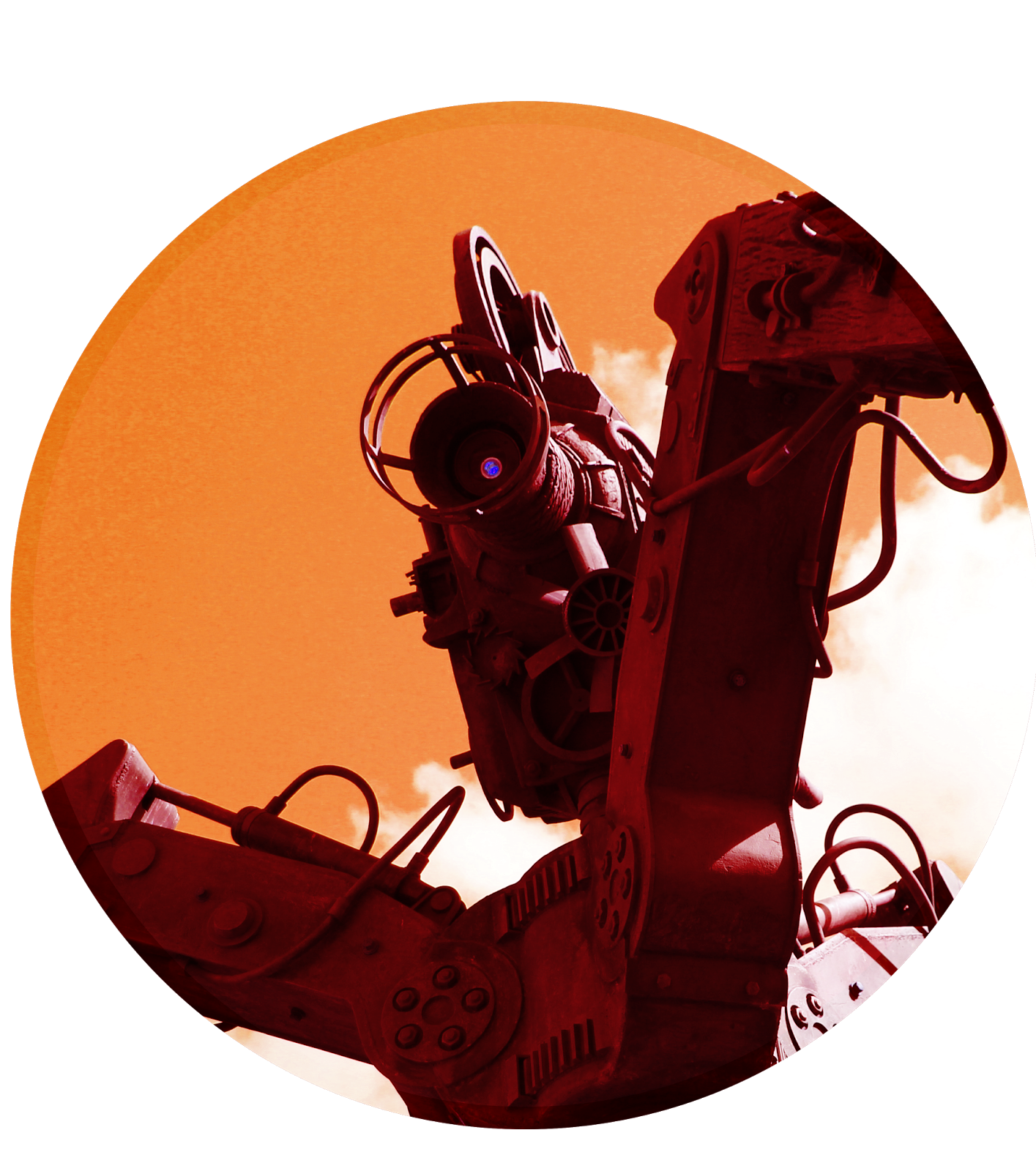
These are pictures/textures i have sourced from the internet which i have later editted in order to create texture etc into my work:
-Maps in circles on spreads were from google maps and then editted by me
- On tripod the majority of the flames were sourced from http://www.photoshoptutorials.ws/downloads/photoshop-brushes/freebie-16-photorealistic-explosion-brushes/
 sourced from http://www.maji4lifeinc.com/wp-content/uploads/2013/10/tumblr_static_water.jpg
.png) sourced from http://pixshark.com/paint-splat-png.htm
sourced from http://pixshark.com/paint-splat-png.htm sourced from http://gorky.deviantart.com/art/Smoke-Sweet-Smoke-49969441
 sourced from http://www.deviantart.com/morelikethis/76453573
 sourced from http://7-themes.com/6829084-flames.html
 sourced from http://www.freeimageslive.co.uk/free_stock_image/embers-jpg
.jpg) sourced from http://www.freeimageslive.co.uk/free_stock_image/fire-sparks-jpg
sourced from http://www.freeimageslive.co.uk/free_stock_image/fire-sparks-jpg